Thank you to our friends at Winsor & Newton for this article
“The pigment in these markers is so intense, this allows me to mix them in improbable ways with a result that is both chaotic and elegant.”
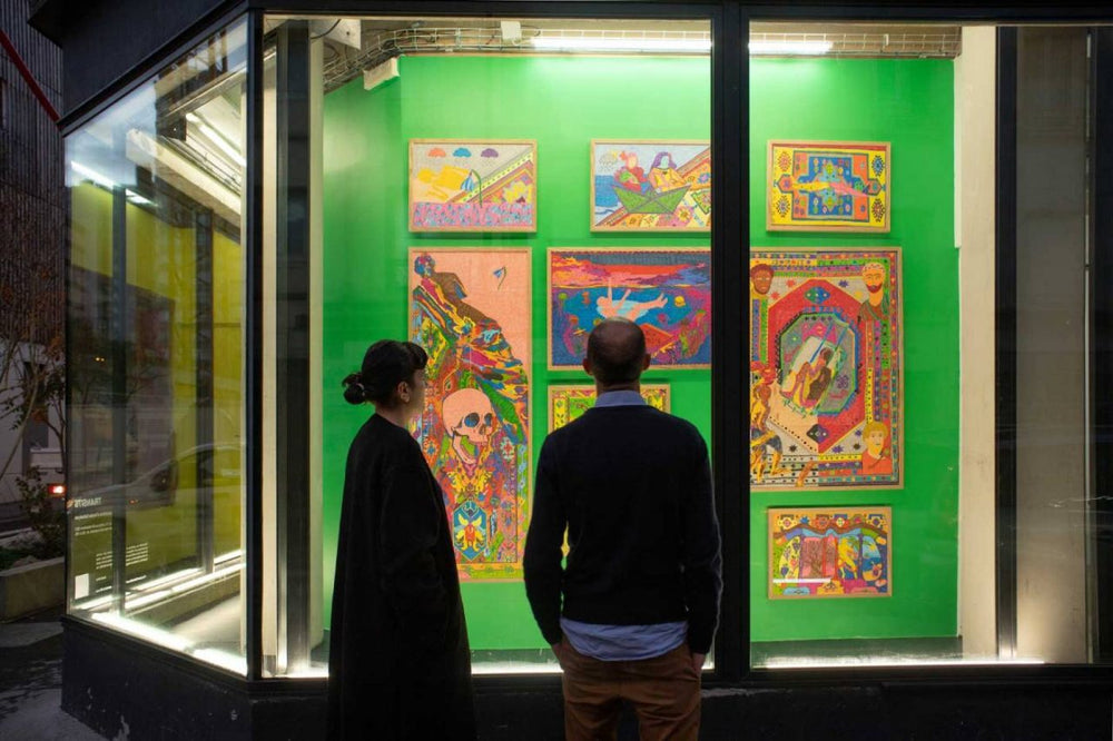
Araks Sahakyan is a Spanish-Armenian artist who combines drawing, video and performance. She graduated from the École Nationale Supérieure d’Arts de Paris-Cergy (ENSAPC) in 2018, after spending an Erasmus semester at Central Saint Martins in London. She was awarded a Drawing Factory residency in Paris in 2021.
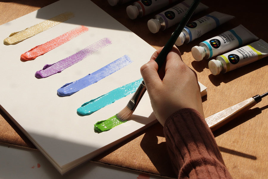
She uses Winsor & Newton Promarker Watercolour extensively to create vast, vibrant ‘paper carpets’ and sketches.

"Since I was a child, I’ve used markers to draw. Their intense and saturated colours are the reflection of both my vision of the world and my souvenirs.
For years I’ve been working on a project inspired by carpets and bookbinding, made with free paper sheets which are stored in a box, once unfolded they become a drawing. This is a project of confluences, of different identities, as well as of collective geopolitical situations and human communications.
I always mix my own experience and life to collective history, because what is history if it is not a collage of several tiny intimate and personal stories? That is the basis of my drawing project where, with paper and markers, I try to express what I feel and what interests me in this world.

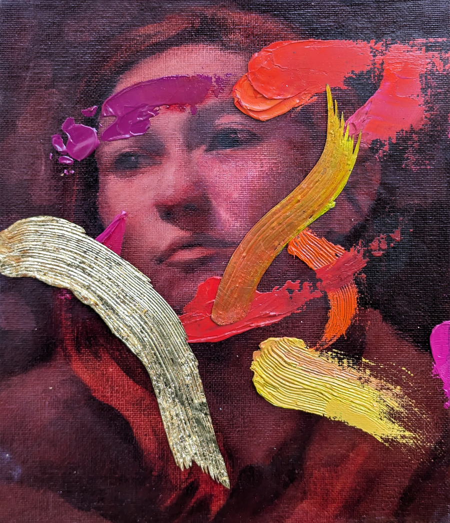
Autumn self-portrait. Watercolour Promarker on Winsor & Newton Bristol paper 250g/m2, 42 free sheets stored, once unfolded become a drawing of 224 x 120 cm, 2021.
Since all my work is about colours and lines, I’d like to comment on my experience using Promarker Watercolour which I use for my drawings.
In several of my recent drawings I use a range of blues to draw recurring elements such as the sea and sky, as well as the clothes in “Autumn Self-Portrait”. The Cerulean Blue Hue has such a nice presence, as well as Phthalo Blue (Green Shade). I used these two colours for the clothes in my “Self-Portrait” to emphasize this calm “blue state of mind” in between a catastrophic situation within a storm outside and water damage inside.

"My love is rotten to the core", Watercolour Promarker on Winsor & Newton Bristol Paper 250g/m2, 16 free sheets, 160.8 x 57 cm, 2021 (image cropped).
I also use many shades of pink, so I was looking for pigment markers with those bright tones. Magenta ended my search; this is not a naïve colour, it is very vivid and corresponds perfectly to what I was looking for. Mauve and Dioxazine Violet are other colours I use. These three tones contrast very well with Pale Pink, which I have been using a lot recently, especially for backgrounds like in the drawing "My love is rotten to the core".
In this same drawing you can how differently colours combine. The pigment in these markers is so intense, this allows me to mix them in improbable ways with a result that is both chaotic and elegant. You can also transform colours by deciding which to use next to each other; for example, Pale Pink looks very different when I use it near blue, red, green and black colours.

‘Olive Tree’ detail. Promarker Watercolour on paper.
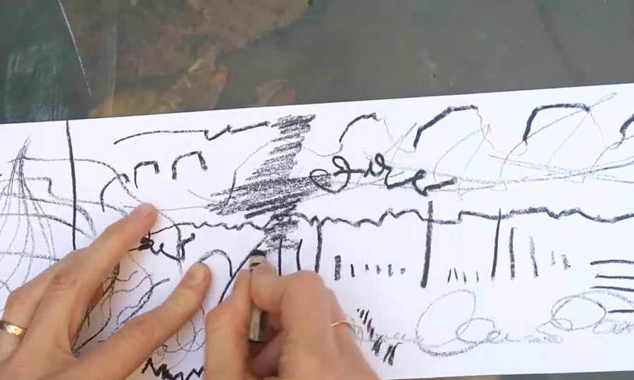
Promarker Watercolour Markers have two tips, one like a traditional tip and the other with the quality of a brush. For several years my artistic practice has focused on drawing with markers, and I was looking for high-quality pigment markers with both rich and soft colours.
In half of my work, I use the marker tip that I’m familiar with, but then my artistic curiosity forced me to try the second brush tip as well. For large surfaces and backgrounds, I enjoy the brush tip. However, I also use it to detail some parts such as the leaves on the painted paper of the "Autumn Self-Portrait" drawing. You can see I’ve gone over this with a brush to add detail, I find it allows more precision than the nib. These two options offer more possibilities to draw a gesture, and this versatility is important to me.

‘The Jungle’ detail. Promarker Watercolour on paper
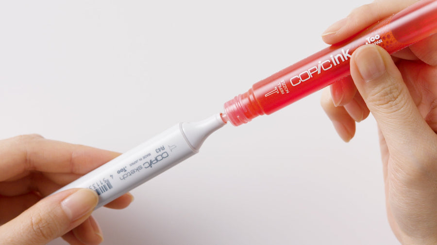
I use Promarker Watercolour for several reasons. Primarily for conservation reasons because they are pigment-based and therefore lightfast, as with traditional watercolours. In addition, they offer several ways to make drawn gestures with the two tips and, finally, the vivid colours are perfect for my work. In future, I’d like to see more light colours included in the range, since most of the colours are deep."
DISCOVER WINSOR & NEWTON PROMARKERS
Recent Articles
May 02, 2024
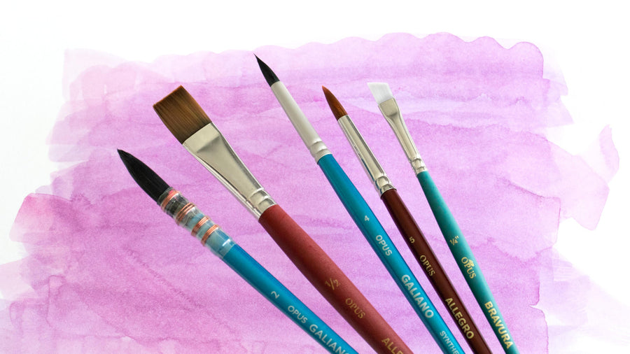
Choosing Your Opus Watercolour Brushes
April 29, 2024
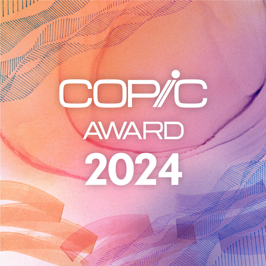
Copic Award 2024
April 28, 2024
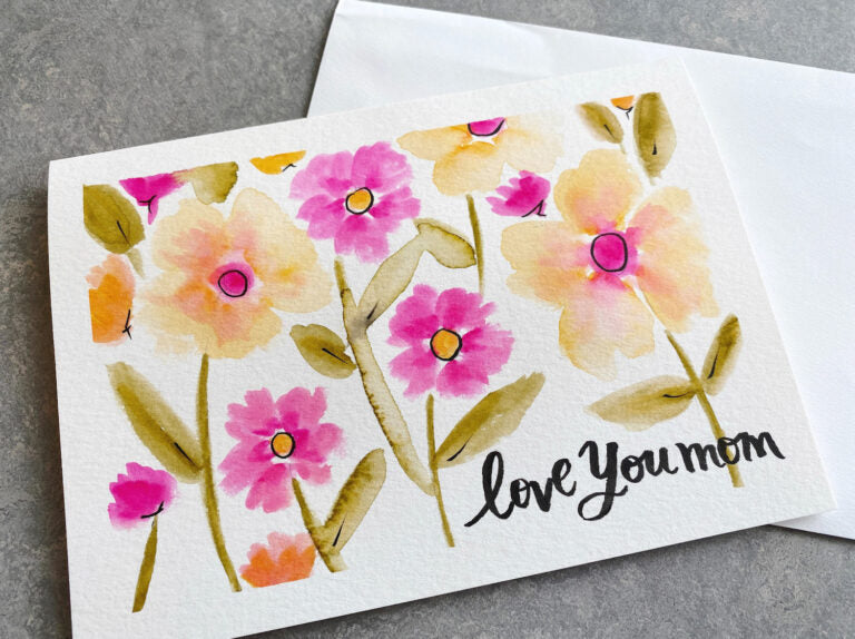
Mother’s Day Card Tutorial Using Dual Brush Pens
April 26, 2024
How To Be An Artist In The World with Wendy Welch
April 18, 2024
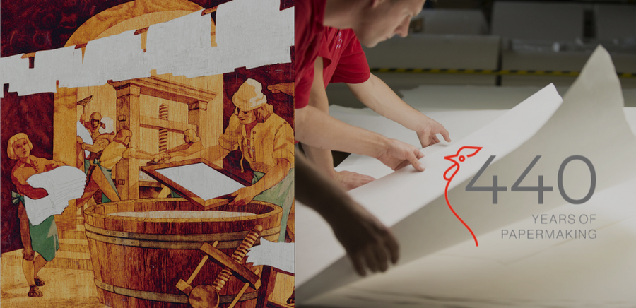
Hahnemühle Celebrates 440 Years
April 15, 2024
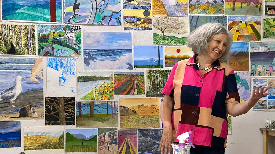
Blossoming As An Artist with Sandy Terry

April 12, 2024
The Opus Warehouse Sale 2024
April 05, 2024
Revival of Colour with Opus Essentials Spring Colours
April 02, 2024
How To Refill COPIC Markers

April 01, 2024
Liquitex: Just Imagine 2024
April 01, 2024
AFK - ArtReach: Drawing What We Hear (grades 4–7)
March 28, 2024
Art Events: Art Vancouver 2024
March 23, 2024
An Exploration Update with Cara Bain
March 20, 2024